Assembly Instructions. Objects like tiny buildings
PRODUCTORA
Curatorial text for the exhibition and catalogue 'Assembly Instructions', at ARCHIVO, Mexico City, 2012 - 2013
A fortunate trip to the city of Los Angeles gave us the possibility to meet first hand the work of architects we had always admired: the Eames, Schindler, Koening, Neutra and Ellwood, as well as their constructive logic and the industrial assembly of their projects. The Case Study Houses were particularly inspiring. A journey to the California desert also introduced us to the work of Albert Frey, a disciple of Le Corbusier, who, after passing through New York, decided to change scenes and moved to the peaceful city of Palm Springs, a vacation getaway for the rich and famous of the time. Of Swiss origin, Frey found in California a source of inspiration for the genesis of his work, although soon the relation with this holiday town turned reciprocal. Frey convinced its well-off citizens, who were used to the warmth of a never-ending summer, to build a Swiss-made cable car that could transport them from the hearth of the desert up to the alpine landscape of the snowed mountains surrounding the valley: a Meccano built on a 1:1 scale.
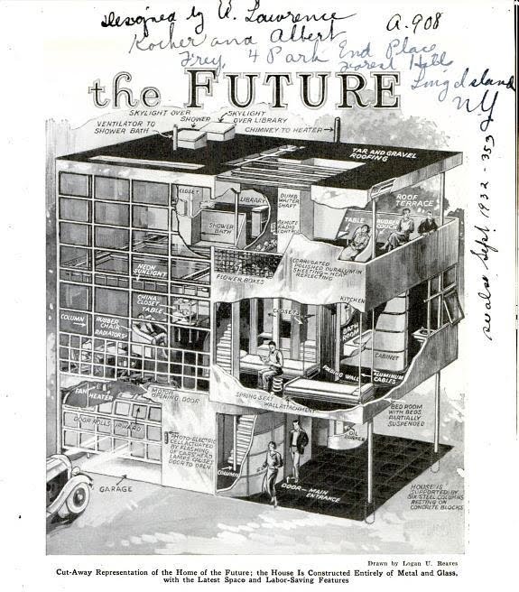
There is a moment in the architect’s career that seems especially important to us. When he arrived in the United States he designed a housing unit called the ‘Aluminaire House’ to be featured at the exhibition of Allied Arts and Building Products of the Architectural League at the Grand Central Palace in New York. He developed the prototype in association with New York architect Lawrence Kocher, who shared his ideas about new construction methods and standards for prefabricated houses. The house, which was mockingly named the ‘Tin House’ or ‘Canned Home’, featured the most avant-guard use of commercial industrialized materials such as aluminum beams and girders, steel deck floors, ribbed aluminum walls, insulation boards and linoleum flooring. The prototype was built in just 10 days and materialized for the first time Frey’s radical experiments in structural aluminum frames and lightweight outer walls. The design of the house also included certain intelligent design features such as a sofa made out of rubber that could be deflated for storage, a retractable dining table and extendable spiral stool.
Surprised with the efficiency of this tiny dwelling, the established American architect Wallace K. Harrison bought the prototype for approximately a thousand dollars. He planned to dissemble the unit and reconstruct it on his farmland in Syosset to use it as a weekend retreat. The story tells that after taking it apart in a matter of hours, its reassembly turned into an epic struggle. After being transported by ship to Long Island the components for the house were left outdoors and a strong rain washed away the identifying chalk markings, leaving a jigsaw puzzle to be put back together. When they finally managed to reassemble the house again, several angles, bolts and connections where left over, and it’s said that the house never ever obtained its original structural stability again.
The Mecano-like fascination of Frey and his hands-on experimentation with structural and cladding elements, are a fascinating example of an architecture in which a boyish like interest in science and the assembly of materials plays a fundamental role (Jean Prouve and his ‘Maison Tropical’ would certainly be another one). This interest in tectonics, or ‘how things are put together’, is certainly a crucial issue that the discipline is fascinated with. The focus on design as a construction craft, is therefore also what we decided to use as a key resource in putting this exhibition together. We are interested in how the architectural notion of ‘the poetics of construction’ can be perfectly applied to industrial design and the objects that surround us.
Objects that function as tiny buildings: planned, sketched and built; objects that are assembled and piled in a never-ending succession of materials and elements, like an architectural structure. The object’s tectonics are always present, whether through a secret existence or playing an visible and fundamental roll. In fact, the success of many artifacts resides precisely in the ease with which they can be transported, assembled and disassembled in order to reconfigure themselves as customized objects.
Once at this point, we cannot avoid thinking of the multinational colossus of IKEA. Their success is based precisely on the principle of flat-packing and in the fact that it’s the users who assemble the furniture. Just like in McDonald’s, where the customer has to do everything by himself, the IKEA stores depend on the good-will and disposition of their users when participating in the production chain. Studies on flat-packs (literally flat packages) began in the 1950’s when one of IKEA’s first designers removed the legs of a LOeVET table in order to fit it in the trunk of his car. The essence of the products of this Swedish brand does not lie solely in their refined Scandinavian look, but also in the comfort that is implicit from their manufacturing up to the assembly line: crating, transportation, storing, the self-service sales system and, above all, the showroom-simulacrum (more real than your own house, Baudrillard would say). A key component of this marketing apparatus is the didactic language of their assembly instructions; instead of long and tedious training courses for their workers, IKEA prefers to indoctrinate their clients on how to assemble their furniture.
We all know that blindly reproducing the image printed on the cardboard box is not the appeal of toys like LEGO, TINKERTOY and MECCANO. What is fun is to give way to the imagination and come up with new compositions built out of the supplied pieces and elements. I am thinking about the work of Israeli video artist Guy Ben-Ner entitled Treehouse, a project commissioned to represent his country in the 51 Venice Biennale. The piece was part of a larger project entitled Self Portrait as a Family Man: an installation formed by a sculpture and a video overlapped in time. During the action one could see the disheveled Ben-Ner turned into a castaway (it is not completely clear whether accidentally or by self-exile) in a prefabricated island. Obsessed with DIY processes he transforms the only tree in the desert oasis into an infinity of furniture and domestic objects. This polymorphic tree is the creative re-configuration of standardized pieces for the construction of beds, lamp tables, closets and domestic furniture very much in line with IKEA. As if it was the result of misreading the assembly instructions, Guy Ben-Ner’s tree does not yield to the logic of an urban department and sprawls all over four meters, taking up all the space. The result is an intuitive and natural assembly process that surpasses the code of any architect or designer. Tectonic knowledge is replaced by the ad hoc creativity of the common citizen who fights back the alienation of contemporary life. The direct relation between the hand of the craftsman, simultaneously inventor and producer, confronts us with the distance that currently exists between designer and final product.
In all the disciplines related to design, from architecture to fashion, there is a moment in the story in which the drawing becomes the necessary meeting point between the head and the creator’s hand. It is thus that the word ‘design’ occurs in architecture: when the craft of the architect and the builder separate themselves and the need arises to close the gap a term is generated, one that christens drawing or planning before building. The complex and reciprocal relationship between drawing and object, between design and construction, between pattern and clothing, opens up questions about the distance between the invention and reproduction of an idea. It is no wonder that many of the patent drawings are worth more that the mass-produced object, and that many of the most iconic architecture and design projects remain in their planning phase.
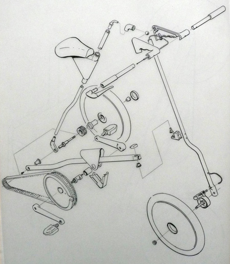
In this exhibition, we are interested in the drawing as crucial within design, an unavoidable link in the process of object production. Nevertheless, far from gloating in the singularity of the artistic and conceptual drawings of famous designers we often see in design museums, our interest lies in the anonymous drawing: the assembly instructions, the cutting patterns or the instruction manual. These drawings return us to an childish stage, when curiosity for the object’s anatomy overwhelmed us with dazzle over the graphic warmth of their designs. The constructive drawing and the illustration in the instructions present the naked object: a practical and state of the matter illustration without compositional or artistic pretentions. Its mechanical engineering logic, the black and white graphic, its index system and code generate a dynamic composition where different scales, layouts, elevations and connections are showcased in unison on a sheet of paper. Exploded axonometric drawings, which are so common in industrial design, remind us of Lissitsky’s drawings where objects, planes, lines and volumes seem to float freely in Euclidian space. In these representations, the object’s unity coexists with the specificity of its constructive elements in an amazing 3-D collage. Inspecting the details, the drawings included in the show broaden the essence of the objects and illustrate their genealogy in a simple and natural way. Let us hope that the drawings incorporated in this exhibition will help widen the show’s landscape and illustrate the assembly process of the selected works.
Images:
(1) Cut-Away" drawing of Kocher and Frey's Aluminaire House from Popular Mechanics (August 1931).
(2) Strida Bicycle, Exploded Axonometric View of its elements, Mark Sanders and Strida Design Team, GB, 2007.


